Wednesday, July 28, 2010

Thursday, December 3, 2009
Index Value Plot

http://images.google.com/imgres?imgurl=http://waterwatch.usgs.gov/regplots/real/real_nc_2.gif&imgrefurl=http://water.usgs.gov/waterwatch/%3Fm%3Dreal%26r%3Dnc%26w%3Dreal%252Cplot&usg=__vkTvnbBvoJv--Wb2BHENjNSJMNU=&h=450&w=550&sz=10&hl=en&start=36&um=1&tbnid=04dzXX99ouN8RM:&tbnh=109&tbnw=133&prev=/images%3Fq%3Dindex%2Bvalue%2Bmap%26ndsp%3D18%26hl%3Den%26client%3Dsafari%26rls%3Den%26sa%3DN%26start%3D18%26um%3D1
Lorenz Curve
 http://images.google.com/imgres?imgurl=http://www.scotland.gov.uk/Resource/Img/182172/0055650.gif&imgrefurl=http://www.scotland.gov.uk/Publications/2007/07/18083820/4&usg=__-kMcopGZLcjjvRFOEq6CJJc6H_k=&h=388&w=571&sz=10&hl=en&start=15&um=1&tbnid=7K4ed4MiFYxldM:&tbnh=91&tbnw=134&prev=/images%3Fq%3Dlorenz%2Bcurve%26hl%3Den%26client%3Dsafari%26rls%3Den%26sa%3DN%26um%3D1
Correlation Matrix

http://images.google.com/imgres?imgurl=http://www.image.ucar.edu/GSP/Projects/JunIPCCModelBiasCorrelations.jpg&imgrefurl=http://www.image.ucar.edu/GSP/Projects/ResearchNuggets.shtml&usg=__sl91IxoAOETxOezdmOKOwILNTYU=&h=504&w=503&sz=279&hl=en&start=12&um=1&tbnid=e9Jxv4ZDW7jWlM:&tbnh=130&tbnw=130&prev=/images%3Fq%3Dcorrelation%2Bmatrix%26hl%3Den%26client%3Dsafari%26rls%3Den%26sa%3DN%26um%3D1
Box Plot

http://images.google.com/imgres?imgurl=http://www.kxcad.net/cae_MATLAB/toolbox/stats/boxplot1.gif&imgrefurl=http://www.kxcad.net/cae_MATLAB/toolbox/stats/boxplot.html&usg=__LPjbYE7A_ThJ3Jm8GD6i4pMlVO0=&h=354&w=476&sz=6&hl=en&start=6&um=1&tbnid=Xjjp1ZZ5MLcQIM:&tbnh=96&tbnw=129&prev=/images%3Fq%3Dbox%2Bplot%26hl%3Den%26client%3Dsafari%26rls%3Den%26sa%3DN%26um%3D1
Tuesday, December 1, 2009
Triangular Plot

http://images.google.com/imgres?imgurl=http://www.pmel.noaa.gov/maillists/tmap/ferret_users/fu_2007/jpgCqrZqdDwYG.jpg&imgrefurl=http://www.pmel.noaa.gov/maillists/tmap/ferret_users/fu_2007/msg00384.html&usg=__BbOkUttPv0jmFyojw9chRDfwJaU=&h=464&w=463&sz=135&hl=en&start=2&um=1&tbnid=lX7Ktsi11XtDBM:&tbnh=128&tbnw=128&prev=/images%3Fq%3Dtriangular%2Bplot%26hl%3Den%26client%3Dsafari%26rls%3Den%26sa%3DN%26um%3D1
Scatter Plot

http://images.google.com/imgres?imgurl=http://www.mzandee.net/~zandee/statistiek/stat-online/chapter4/graphics/age_scatterplot.gif&imgrefurl=http://www.mzandee.net/~zandee/statistiek/stat-online/chapter4/pearson.html&usg=__914qCRxxlhsZIPs0iySmpD34iRY=&h=350&w=385&sz=5&hl=en&start=1&um=1&tbnid=nOUtkebkMbVnJM:&tbnh=112&tbnw=123&prev=/images%3Fq%3Dscatter%2Bplot%26hl%3Den%26client%3Dsafari%26rls%3Den%26sa%3DN%26um%3D1
Parallel Coordinate Plot
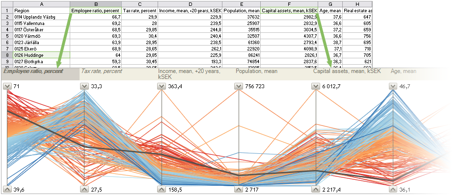
http://images.google.com/imgres?imgurl=http://servus.itn.liu.se/projects/geowizard/images/sheetpcb.png&imgrefurl=http://servus.itn.liu.se/projects/geowizard/index_e.html&usg=__4cVO6w6UlFMa2RHpDmfPrzz2rGc=&h=398&w=945&sz=241&hl=en&start=9&um=1&tbnid=eawL_n2ANQs72M:&tbnh=62&tbnw=148&prev=/images%3Fq%3Dparallel%2Bcoordinate%2Bplot%26hl%3Den%26client%3Dsafari%26rls%3Den%26sa%3DN%26um%3D1
Star Plot

http://images.google.com/imgres?imgurl=http://upload.wikimedia.org/wikipedia/commons/0/09/MER_Star_Plot.gif&imgrefurl=http://commons.wikimedia.org/wiki/Category:Star_plots&usg=__2vejI3nBiIAtqK53ENebF-pDNPE=&h=438&w=560&sz=28&hl=en&start=1&um=1&tbnid=A6om0JWZVvDnEM:&tbnh=104&tbnw=133&prev=/images%3Fq%3Dstar%2Bplots%26hl%3Den%26client%3Dsafari%26rls%3Den%26sa%3DN%26um%3D1\
Similarity Matrix

http://images.google.com/imgres?imgurl=http://tomcat.esat.kuleuven.be/txtgate/images/distmat.png&imgrefurl=http://tomcat.esat.kuleuven.be/txtgate/tutorial.jsp&usg=__8RIot2zOHeydt2Msr72ulaHhGV0=&h=559&w=455&sz=10&hl=en&start=1&um=1&tbnid=8i8FvcwpEiookM:&tbnh=133&tbnw=108&prev=/images%3Fq%3Dsimilarity%2Bmatrix%26hl%3Den%26client%3Dsafari%26rls%3Den%26sa%3DN%26um%3D1
Stem and Leaf Plot

http://images.google.com/imgres?imgurl=http://www.learner.org/courses/learningmath/data/images/session3/3h1.gif&imgrefurl=http://www.learner.org/courses/learningmath/data/session3/part_h/homework.html&usg=__6nq8Oupp9PX2frSS_eKPySp38_k=&h=282&w=225&sz=4&hl=en&start=8&um=1&tbnid=mOMDPld35aQoDM:&tbnh=114&tbnw=91&prev=/images%3Fq%3Dstem%2Band%2Bleaf%2Bplot%26hl%3Den%26client%3Dsafari%26rls%3Den%26sa%3DN%26um%3D1
Wind Rose

http://images.google.com/imgres?imgurl=http://www.kids.esdb.bg/images/windrose_time.png&imgrefurl=http://www.kids.esdb.bg/wind.html&usg=__Hmr1JJrnev0gl9sTJSpuSqZPz58=&h=316&w=339&sz=85&hl=en&start=17&um=1&tbnid=oO9A62qeuyswsM:&tbnh=111&tbnw=119&prev=/images%3Fq%3Dwindrose%26hl%3Den%26client%3Dsafari%26rls%3Den%26sa%3DN%26um%3D1
Climograph

http://images.google.com/imgres?imgurl=http://www.uwsp.edu/geo/faculty/lemke/geog101/images/09_climograph_BSh.gif&imgrefurl=http://www.uwsp.edu/geo/faculty/lemke/geog101/lecture_outlines/09_global_climate_patterns.html&usg=__sha17X9I3AnVASD2UXLlNmbE4G0=&h=458&w=400&sz=15&hl=en&start=1&um=1&tbnid=UOhYJArUZDVnLM:&tbnh=128&tbnw=112&prev=/images%3Fq%3Dclimograph%26hl%3Den%26client%3Dsafari%26rls%3Den%26sa%3DN%26um%3D1
Population Profile
 Population profile shows the number of people as a function of their ages. It can be considered a map because it displays readable information.
http://images.google.com/imgres?imgurl=http://www.coventry.gov.uk/ccm/cms-service/stream/image/%3Fimage_id%3D1660022&imgrefurl=http://www.coventry.gov.uk/redirect/%3Foid%3D%255Bcom.arsdigita.categorization.Category%253A%257Bid%253D1665010%257D%255D&usg=__ewQC6nrJfuMNWV7uwJnPapz80YE=&h=327&w=532&sz=54&hl=en&start=1&um=1&tbnid=dD14UsOf7i8g3M:&tbnh=81&tbnw=132&prev=/images%3Fq%3Dpopulation%2Bprofile%26hl%3Den%26client%3Dsafari%26rls%3Den%26sa%3DN%26um%3D1
Black and White Aerial Map

http://images.google.com/imgres?imgurl=http://www.jesseshunting.com/images/aerial-photo-weldon.jpg&imgrefurl=http://www.jesseshunting.com/site/aerial.html&usg=__HLZah2KRwqCcanoQwQ47iOAzFBE=&h=508&w=518&sz=46&hl=en&start=2&um=1&tbnid=szwcXG1UFiDVFM:&tbnh=128&tbnw=131&prev=/images%3Fq%3Dblack%2Band%2Bwhite%2Bemulsion%2Baerial%2Bmap%26hl%3Den%26client%3Dsafari%26rls%3Den%26sa%3DN%26um%3D1
Tuesday, November 24, 2009
Digital Raster Graphics

http://images.google.com/imgres?imgurl=http://www.pasda.psu.edu/tutorials/arcgis/images/drg.jpg&imgrefurl=http://www.pasda.psu.edu/tutorials/arcgis/drg.asp&usg=__7KzpwdcA9tkISEzsZVyptfNhB6E=&h=619&w=800&sz=692&hl=en&start=18&um=1&tbnid=PfYmaS9k6hnf4M:&tbnh=111&tbnw=143&prev=/images%3Fq%3Ddigital%2Braster%2Bgraphic%26ndsp%3D18%26hl%3Den%26client%3Dsafari%26rls%3Den%26sa%3DX%26um%3D1
The DRG uses a scanned image from the USGS standard series topographic map. It uses a UTM projection and georeferences the Earth.
Digital Line Graph

http://images.google.com/imgres?imgurl=http://proceedings.esri.com/library/userconf/proc00/professional/papers/PAP691/p6911.gif&imgrefurl=http://proceedings.esri.com/library/userconf/proc00/professional/papers/PAP691/p691.htm&usg=__xvXJRDNCLhratJEGzHL2Uc2k4U4=&h=322&w=260&sz=52&hl=en&start=23&um=1&tbnid=2JBE1V-hpoBkZM:&tbnh=118&tbnw=95&prev=/images%3Fq%3Ddigital%2Bline%2Bgraph%26ndsp%3D18%26hl%3Den%26client%3Dsafari%26rls%3Den%26sa%3DN%26start%3D18%26um%3D1
The DLG uses digital vector data. It can include a wide range of factors from topography to boundaries to roads. Map features are displayed by lines, points, and areas.
Digital Orthographic Quarter-Quads

http://images.google.com/imgres?imgurl=http://www.freac.fsu.edu/tap/doqutil/beach1.jpg&imgrefurl=http://www.freac.fsu.edu/tap/doqutil/&usg=__zzs1BiSM6Gpj2e0aoF_IJZWJqwk=&h=314&w=232&sz=13&hl=en&start=3&um=1&tbnid=J2essIyGHg0YXM:&tbnh=117&tbnw=86&prev=/images%3Fq%3DDigital%2BOrthographic%2BQuarter-Quads%26ndsp%3D18%26hl%3Den%26client%3Dsafari%26rls%3Den%26sa%3DG%26um%3D1
The DOQQ is an aerial photograph that includes geometric qualities of a map. It displays true position which allows for more accurate measurement.
Digital Elevation Models

The DEM is a digital representation of the elevation of terrains. It uses a raster format to display data. It is used often in GIS.
USGS Topo Map

http://images.google.com/imgres?imgurl=http://www.expertgps.com/images/ExpertGPS-GPS-Mapping-Software-Topo-Map.jpg&imgrefurl=http://www.expertgps.com/topographic-maps-for-hiking-trips.asp&usg=__sbSZdL1eWPsz_NjW_BdixOHgibw=&h=400&w=400&sz=278&hl=en&start=4&um=1&tbnid=oEThwYEkmVVY9M:&tbnh=124&tbnw=124&prev=/images%3Fq%3DUSGS%2Btopo%2Bmap%26ndsp%3D18%26hl%3Den%26client%3Dsafari%26rls%3Den%26sa%3DG%26um%3D1
The USGS topo map displays 7.5 minutes of latitude and 7.5 minutes of longitude of a four-sided area. It includes UTM and State plane coordinates. This is a USGS topo map of an area in New Hampshire.