Tuesday, November 24, 2009

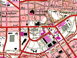
Digital Raster Graphics


http://images.google.com/imgres?imgurl=http://www.pasda.psu.edu/tutorials/arcgis/images/drg.jpg&imgrefurl=http://www.pasda.psu.edu/tutorials/arcgis/drg.asp&usg=__7KzpwdcA9tkISEzsZVyptfNhB6E=&h=619&w=800&sz=692&hl=en&start=18&um=1&tbnid=PfYmaS9k6hnf4M:&tbnh=111&tbnw=143&prev=/images%3Fq%3Ddigital%2Braster%2Bgraphic%26ndsp%3D18%26hl%3Den%26client%3Dsafari%26rls%3Den%26sa%3DX%26um%3D1


The DRG uses a scanned image from the USGS standard series topographic map. It uses a UTM projection and georeferences the Earth.
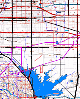

Digital Line Graph


http://images.google.com/imgres?imgurl=http://proceedings.esri.com/library/userconf/proc00/professional/papers/PAP691/p6911.gif&imgrefurl=http://proceedings.esri.com/library/userconf/proc00/professional/papers/PAP691/p691.htm&usg=__xvXJRDNCLhratJEGzHL2Uc2k4U4=&h=322&w=260&sz=52&hl=en&start=23&um=1&tbnid=2JBE1V-hpoBkZM:&tbnh=118&tbnw=95&prev=/images%3Fq%3Ddigital%2Bline%2Bgraph%26ndsp%3D18%26hl%3Den%26client%3Dsafari%26rls%3Den%26sa%3DN%26start%3D18%26um%3D1


The DLG uses digital vector data. It can include a wide range of factors from topography to boundaries to roads. Map features are displayed by lines, points, and areas.

Digital Orthographic Quarter-Quads


http://images.google.com/imgres?imgurl=http://www.freac.fsu.edu/tap/doqutil/beach1.jpg&imgrefurl=http://www.freac.fsu.edu/tap/doqutil/&usg=__zzs1BiSM6Gpj2e0aoF_IJZWJqwk=&h=314&w=232&sz=13&hl=en&start=3&um=1&tbnid=J2essIyGHg0YXM:&tbnh=117&tbnw=86&prev=/images%3Fq%3DDigital%2BOrthographic%2BQuarter-Quads%26ndsp%3D18%26hl%3Den%26client%3Dsafari%26rls%3Den%26sa%3DG%26um%3D1


The DOQQ is an aerial photograph that includes geometric qualities of a map. It displays true position which allows for more accurate measurement.

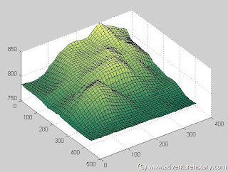
Digital Elevation Models


http://images.google.com/imgres?imgurl=http://www.adventurehistory.com/images/3ddem.jpg&imgrefurl=http://www.adventurehistory.com/miscellaneous/advanceduseofmapsoftware/digitalelevationmodeldemcreatedbymatlab.html&usg=__DNfBfzOiQASxRwISYqVhr-jz6I4=&h=393&w=519&sz=50&hl=en&start=7&um=1&tbnid=R2t9CeDqJ1T83M:&tbnh=99&tbnw=131&prev=/images%3Fq%3Ddigital%2Belevation%2Bmodel%26ndsp%3D18%26hl%3Den%26client%3Dsafari%26rls%3Den%26sa%3DG%26um%3D1


The DEM is a digital representation of the elevation of terrains. It uses a raster format to display data. It is used often in GIS.

USGS Topo Map


http://images.google.com/imgres?imgurl=http://www.expertgps.com/images/ExpertGPS-GPS-Mapping-Software-Topo-Map.jpg&imgrefurl=http://www.expertgps.com/topographic-maps-for-hiking-trips.asp&usg=__sbSZdL1eWPsz_NjW_BdixOHgibw=&h=400&w=400&sz=278&hl=en&start=4&um=1&tbnid=oEThwYEkmVVY9M:&tbnh=124&tbnw=124&prev=/images%3Fq%3DUSGS%2Btopo%2Bmap%26ndsp%3D18%26hl%3Den%26client%3Dsafari%26rls%3Den%26sa%3DG%26um%3D1


The USGS topo map displays 7.5 minutes of latitude and 7.5 minutes of longitude of a four-sided area. It includes UTM and State plane coordinates. This is a USGS topo map of an area in New Hampshire.

Bivariate choropleth map


http://images.google.com/imgres?imgurl=http://pubs.usgs.gov/tm/tm11c2/images/coverphoto.jpg&imgrefurl=http://pubs.usgs.gov/tm/tm11c2/&usg=__SZvZS3BY3AalgvcxNF3KfmQoxBk=&h=580&w=533&sz=58&hl=en&start=40&um=1&tbnid=UDoLzUvamzCKHM:&tbnh=134&tbnw=123&prev=/images%3Fq%3Dchoropleth%2Bmap%26ndsp%3D18%26hl%3Den%26client%3Dsafari%26rls%3Den%26sa%3DN%26start%3D36%26um%3D1


A bivariate map displays two variables on a map. This map shows the census of people.

Classes Choropleth Map


http://images.google.com/imgres?imgurl=http://www2.geog.soton.ac.uk/geo-refer/images/s_us%2520states%2520choropleth%2520map%2520population%2520density%2520final.png&imgrefurl=http://www2.geog.soton.ac.uk/geo-refer/go2_525_c15p00000000sarc.html&usg=__k6Hl-yZLWm0DUS1GlUe9BtR1KNo=&h=442&w=554&sz=102&hl=en&start=4&um=1&tbnid=AE6D53Bpq71ZfM:&tbnh=106&tbnw=133&prev=/images%3Fq%3Dclasses%2Bchoropleth%2Bmap%26hl%3Den%26client%3Dsafari%26rls%3Den%26sa%3DG%26um%3D1


Classes cloropleth maps portrays data broken down into intervals. It can be broken down into intervals using equal steps, quantile, natural breaks, or minimal variance. This map is broken down using equal steps.


Monday, November 23, 2009

Social Network Map


http://images.google.com/imgres?imgurl=http://weblogs.hitwise.com/heather-hopkins/Network%2520Map%2520Thumb.png&imgrefurl=http://weblogs.hitwise.com/heather-hopkins/2006/11/bebo_and_myspace_network_maps.html&usg=__4g--DAj9NkOE0271PzA86pDoywA=&h=445&w=685&sz=39&hl=en&start=15&um=1&tbnid=nM61xZvq4LFTUM:&tbnh=90&tbnw=139&prev=/images%3Fq%3Dsocial%2Bnetwork%2Bmap%26hl%3Den%26client%3Dsafari%26rls%3Den%26sa%3DX%26um%3D1


Social Network Map is a map that shows the social structure of nodes that are connected by a type of interdependency. It is a type of radial flow map. This map shows the connection of social internet websites.

traffic flow map


http://images.google.com/imgres?imgurl=http://www.spokanestreetdepartment.org/graphics/flowmap/flow94-95.jpg&imgrefurl=http://www.spokanestreetdepartment.org/flowmaps.htm&usg=__iH5yWYI4n4UjIVi4E0l8CyJh1gc=&h=341&w=424&sz=23&hl=en&start=10&um=1&tbnid=QIsyEyIDr_7-ZM:&tbnh=101&tbnw=126&prev=/images%3Fq%3Dtraffic%2Bflow%2Bmap%26hl%3Den%26client%3Dsafari%26rls%3Den%26sa%3DX%26um%3D1


Traffic can be displayed using a flow map. This map shows traffic in Spokane.

Non proportional point symbol dot density map


http://images.google.com/imgres?imgurl=https://courseware.e-education.psu.edu/courses/geog482/graphics/hisp_dots.gif&imgrefurl=https://courseware.e-education.psu.edu/courses/geog482/L03_compiled.html&usg=__1za2QtWmbmO0ppsppla2sfsYtO4=&h=373&w=499&sz=18&hl=en&start=1&um=1&tbnid=nCfUo9brWCLHTM:&tbnh=97&tbnw=130&prev=/images%3Fq%3DProportional%2Bpoint%2Bsymbol%2BDot%2BDensity%2BMap%2Bhispanic%2Bpopulation%26hl%3Den%26client%3Dsafari%26rls%3Den%26um%3D1


Non proportional point symbol dot density map's dots don't vary in size. Each dot represents 100,000. This map shows the hispanic population in the United States.

Proportional point symbol Dot Density Map


http://images.google.com/imgres?imgurl=https://courseware.e-education.psu.edu/courses/geog482/graphics/hisp_circles.gif&imgrefurl=https://courseware.e-education.psu.edu/courses/geog482/L03_compiled.html&usg=__IcjvReGPJ29MzBtZ3x9DK_-b0EQ=&h=376&w=499&sz=19&hl=en&start=5&um=1&tbnid=B97QzdVO51PkDM:&tbnh=98&tbnw=130&prev=/images%3Fq%3DProportional%2Bpoint%2Bsymbol%2BDot%2BDensity%2BMap%2Bhispanic%2Bpopulation%26hl%3Den%26client%3Dsafari%26rls%3Den%26um%3D1


Proportional point symbol Dot Density Map's dots varies in size. The size of the dot depends on the measured variable. This map shows the hispanic population in the United States.


Geopotential Map


http://images.google.com/imgres?imgurl=http://www.ccpo.odu.edu/SEES/ozone/class/Chap_6/6_Js/6-14.jpg&imgrefurl=http://www.boards.ie/vbulletin/showthread.php%3Ft%3D2055728070&usg=__DXJ3Okv5EPEi97cvEswtPBQNBIw=&h=636&w=504&sz=210&hl=en&start=3&um=1&tbnid=2Sx76gVMA2ql4M:&tbnh=137&tbnw=109&prev=/images%3Fq%3Dgeopotential%2Bmap%26hl%3Den%26client%3Dsafari%26rls%3Den%26sa%3DN%26um%3D1


Geopotential height maps are a type of contour map. It shows the elevation of a given air pressure. This map uses colors and contour lines to display the information.

Isobar


http://images.google.com/imgres?imgurl=http://www.uwlax.edu/faculty/skala/Image58.gif&imgrefurl=http://www.uwlax.edu/faculty/skala/Air-Pressure.htm&usg=__ffISsJydQrKSHMIPa9p0uuTy9fY=&h=650&w=900&sz=29&hl=en&start=4&um=1&tbnid=C45iMAmp8OCR9M:&tbnh=105&tbnw=146&prev=/images%3Fq%3Disobar%26hl%3Den%26client%3Dsafari%26rls%3Den%26sa%3DG%26um%3D1


Isobar maps are a type of contour map. It shows air pressure. This map shows the air pressure of the United States.

Isotach map


http://images.google.com/imgres?imgurl=http://www.whitsettnc.com/My_Homepage_Files/Download/WhitsettLighting_files/image004.jpg&imgrefurl=http://www.whitsettnc.com/My_Homepage_Files/Download/WhitsettLighting.htm&usg=__40Pp8IBEQthcxtTLdD1HuwV-rLE=&h=694&w=623&sz=57&hl=en&start=5&um=1&tbnid=AHQHXiQvUw5xCM:&tbnh=139&tbnw=125&prev=/images%3Fq%3Disotach%2Bwind%2Bmap%26hl%3Den%26client%3Dsafari%26rls%3Den%26um%3D1


Isotach maps are a type of contour map. It shows wind speed. This map uses colors to display the wind speed.

Isopachs


http://www.volcano.si.edu/world/volcano.cfm?vnum=1402-11=&volpage=var


Isopach maps is a type of contour map. It shows rock or sediment thickness.

Isohyets


http://images.google.com/imgres?imgurl=http://www.environment.gov.au/soe/2001/publications/technical/wind-erosion/images/fig05.jpg&imgrefurl=http://www.environment.gov.au/soe/2001/publications/technical/wind-erosion/index.html&usg=__IlfRpB54VsevrAHPi64FnGrXGNA=&h=374&w=450&sz=24&hl=en&start=6&um=1&tbnid=xSsNedUMlcGJnM:&tbnh=106&tbnw=127&prev=/images%3Fq%3Disohyet%2Bmap%26hl%3Den%26client%3Dsafari%26rls%3Den%26sa%3DG%26um%3D1


An isohyet map is a type of contour map. It shows the amount of rainfall in an area.

Bathymetric map


http://images.google.com/imgres?imgurl=http://www.epa.gov/ne/boldkids/images/bathymetric-map.jpg&imgrefurl=http://www.epa.gov/ne/boldkids/scienceonboard.html&usg=__3D7vMkJIHEup-VZjtfLBeMoy4nQ=&h=446&w=622&sz=87&hl=en&start=6&um=1&tbnid=KSC8A3sdoslN9M:&tbnh=98&tbnw=136&prev=/images%3Fq%3Dbathymetric%2Bmap%26hl%3Den%26client%3Dsafari%26rls%3Den%26sa%3DG%26um%3D1


Bathymetric maps show sea floor elevation. It is a type of contour map.

Hypsometric Map


http://images.google.com/imgres?imgurl=http://www.landkarten.aridocean.com/styles/france_relief-2_thumb.jpg&imgrefurl=http://www.landkarten.aridocean.com/&usg=__C-MIhu_GeG2CUzKoGAbAwP-2soU=&h=297&w=300&sz=154&hl=en&start=18&um=1&tbnid=-vglmoS_QxcZyM:&tbnh=115&tbnw=116&prev=/images%3Fq%3Dhypsometric%2Bmap%26hl%3Den%26client%3Dsafari%26rls%3Den%26um%3D1


A hypsometric map is a surface map that shows relief in 3-D. The 3-D variable doesn't always show relief. This map shows relief using color, shaping, and raised relief.

LIDAR


http://images.google.com/imgres?imgurl=http://www.math.ucdavis.edu/~widemann/research/Ground_Zero_Lidar.jpg&imgrefurl=http://www.math.ucdavis.edu/~widemann/research/research.html&usg=__IqW9luAz3Zlx8gdBykVLsAputj0=&h=450&w=586&sz=135&hl=en&start=2&um=1&tbnid=lNPx6fGBHc6IdM:&tbnh=104&tbnw=135&prev=/images%3Fq%3DLIDAR%26ndsp%3D18%26hl%3Den%26client%3Dsafari%26rls%3Den%26sa%3DG%26um%3D1


LIDAR uses laser pulses and GPS to develop detailed images of Earth's surface. This map shows a city and it's buildings. It helps to determine distance to an object.

Geological Map


http://images.google.com/imgres?imgurl=http://www.geology.19thcenturyscience.org/books/1878-Ramsay-Geology/text-ocr/text/figs-100-jpg/GeoMap-400.jpg&imgrefurl=http://www.carbonet.net/forum/viewtopic.php%3Fp%3D445%26sid%3D115ca8888ed1b168f3af3c0201068181&usg=__58M3DrjjnLI88D4evS3M4v6eo4Q=&h=4000&w=2464&sz=1026&hl=en&start=10&um=1&tbnid=JpElmdp6inRSBM:&tbnh=150&tbnw=92&prev=/images%3Fq%3Dgeological%2Bmap%26ndsp%3D18%26hl%3Den%26client%3Dsafari%26rls%3Den%26sa%3DX%26um%3D1


Geological maps is a special purpose map used to show geological features. This particular map uses colors to show the difference of rocks and soil.

Weather Forecasting map


http://images.google.com/imgres?imgurl=http://www.hpc.ncep.noaa.gov/noaa/national_forecast.jpg&imgrefurl=http://www.weathermap.us/&usg=__f4bzZQ2ExWdBzHdtD_hXV3sOm6k=&h=412&w=515&sz=360&hl=en&start=2&um=1&tbnid=MLaBK8LbNQVHQM:&tbnh=105&tbnw=131&prev=/images%3Fq%3Dweather%2Bforecasting%2Bmap%26ndsp%3D18%26hl%3Den%26client%3Dsafari%26rls%3Den%26sa%3DG%26um%3D1


Weather forecasting maps are another type of special purpose map. It shows the meteorological conditions of the United States at a specific time.

Historical Map


http://images.google.com/imgres?imgurl=http://upload.wikimedia.org/wikipedia/commons/archive/8/88/20060401173342!Historical-map-of-Sicily-bjs-1.jpg&imgrefurl=http://commons.wikimedia.org/wiki/File:Historical-map-of-Sicily-bjs-1.jpg&usg=__AocykFmlKmO5CjYDoXtYqTt0zJk=&h=1309&w=1749&sz=943&hl=en&start=22&um=1&tbnid=i5K63k2OhqP7YM:&tbnh=112&tbnw=150&prev=/images%3Fq%3Dhistorical%2Bmap%26ndsp%3D18%26hl%3Den%26client%3Dsafari%26rls%3Den%26sa%3DN%26start%3D18%26um%3D1

Historical maps are a special purpose map. It shows a map from the past.


Statistic Map


http://images.google.com/imgres?imgurl=http://www.idea-envi.cz/img/mapgenerator/rain2005.png&imgrefurl=http://www.idea-envi.cz/produkty_mapgen_en.html&usg=__b9d8lddLlCYMaofKK7ua4rORkPw=&h=350&w=563&sz=40&hl=en&start=3&um=1&tbnid=6tl1WLLyC98nrM:&tbnh=83&tbnw=133&prev=/images%3Fq%3Dstatistic%2Bmap%26ndsp%3D18%26hl%3Den%26client%3Dsafari%26rls%3Den%26sa%3DG%26um%3D1


Statistical maps shows a variation in quantity of a certain factor. This particular map shows the variation of rainfall.


Cartogram


http://images.google.com/imgres?imgurl=http://www.dashboardinsight.com/CMS/0c5dbe13-68eb-4c7a-9bf4-f8fc0896d16a/US_Presidential_Election_County_Level_Cartogram_large.png&imgrefurl=http://www.dashboardinsight.com/articles/new-concepts-in-business-intelligence/maps-of-the-2008-us-presidential-election-results.aspx&usg=__wK6UWvZfvLoXrib3fYe8ebyoINM=&h=692&w=1024&sz=316&hl=en&start=7&um=1&tbnid=Gd5Wq8TykQ0biM:&tbnh=101&tbnw=150&prev=/images%3Fq%3Dcartogram%26ndsp%3D18%26hl%3Den%26client%3Dsafari%26rls%3Den%26sa%3DG%26um%3D1


A cartogram is a map that uses a thematic variable is substituted for land area. The map is distorted to portray the variable.

State Plan Coordinate System


http://images.google.com/imgres?imgurl=http://www.cdpr.ca.gov/docs/county/pumpdvlp/devgrp/prjctdta/stplane.gif&imgrefurl=http://www.cdpr.ca.gov/docs/county/pumpdvlp/devgrp/prjctdta/pres0401.htm&usg=__FF8WRc71k1qV3mo1YS3CDto3E_0=&h=384&w=576&sz=7&hl=en&start=23&um=1&tbnid=6oe08eqcxoFzaM:&tbnh=89&tbnw=134&prev=/images%3Fq%3Dstate%2Bplane%2Bcoordinate%26ndsp%3D18%26hl%3Den%26client%3Dsafari%26rls%3Den%26sa%3DN%26start%3D18%26um%3D1


Each state has a different coordinate system, this map shows California's coordinate system. State coordinate systems use feet, not meters.

PLSS


http://images.google.com/imgres?imgurl=http://gis.nwcg.gov/giss_2006/job_aids/maps_and_graphics/USA_PLSS_Meridians_map.jpg&imgrefurl=http://gis.nwcg.gov/giss_2006/cd_contents.html&usg=__6fwSrzU16-Z48U9DJZUVEjApsv8=&h=1095&w=1595&sz=812&hl=en&start=4&um=1&tbnid=kcYAKM5FpuL4SM:&tbnh=103&tbnw=150&prev=/images%3Fq%3DPLSS%26hl%3Den%26client%3Dsafari%26rls%3Den%26sa%3DG%26um%3D1


PLSS maps covers most of the United States except the 13 original colonies and Texas. Everything else is considered "unsystematic". It has 34 principal meridians and baselines.

Cadastral Map


http://images.google.com/imgres?imgurl=http://www.dalisproject.org/images/cadastral_map.jpg&imgrefurl=http://www.dalisproject.org/pages/findMapsheet.aspx&usg=__mJUU5a9Y7RlAn35NmCIr9IAHIwQ=&h=467&w=558&sz=206&hl=en&start=1&um=1&tbnid=Q6XIQv0G_aOKQM:&tbnh=111&tbnw=133&prev=/images%3Fq%3Dcadastral%2Bmap%26hl%3Den%26client%3Dsafari%26rls%3Den%26sa%3DG%26um%3D1


Cadastral maps show boundaries and land ownership. It uses the metes and bounds system.

Followers